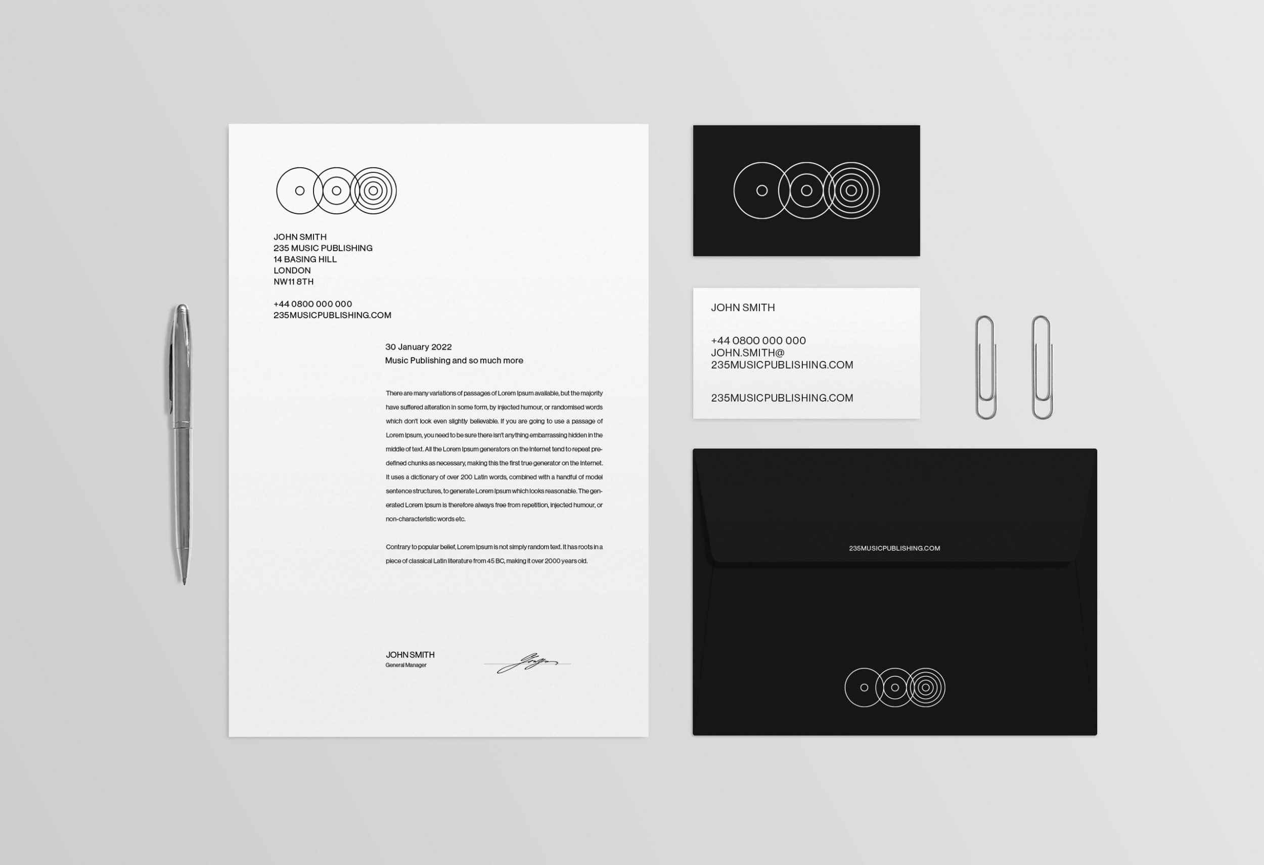
235 Music Publishing reached out to Another Kind to help with creating a clean and minimal brand identity for their forward thinking company. Final deliverables would include new logos, business cards, company stationary and a bespoke new website.
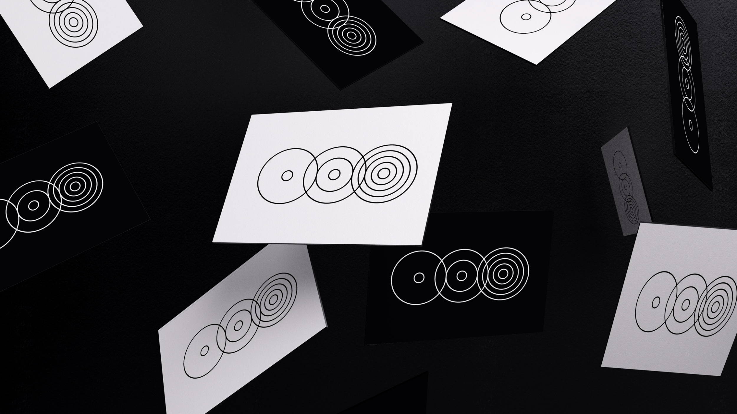
The brand identity had to be minimal enough to let artist imagery be the main focus of a new website yet bold enough to catch people’s eyes when seen on its own. We created a simple overlapping circular logo design that took inspiration from sound waves whilst also representing the company’s numbers in the abstract ascending rings. We paired the rings with an all caps typeface logo that would also inform the general no frills aesthetic of the brand’s wider typography.
Services
- Brand Identity
- Website