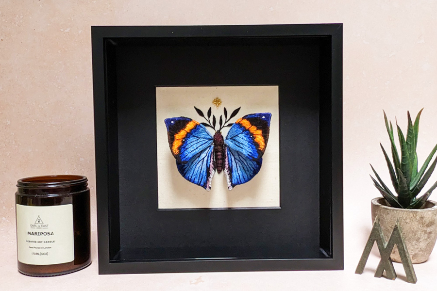
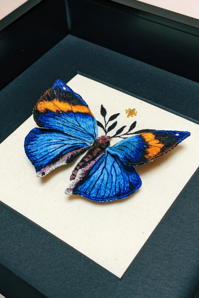
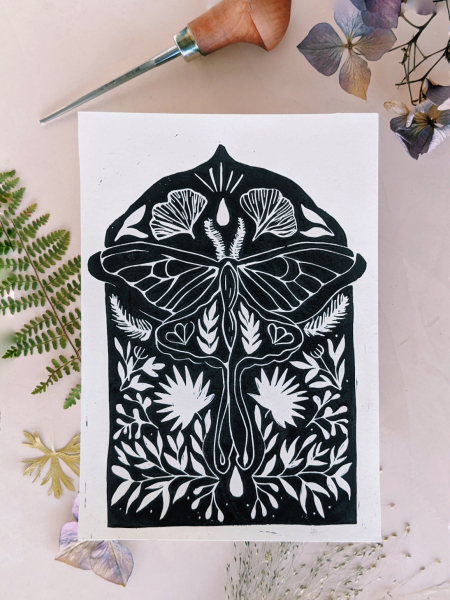
An embroidery artist from London obsessed with nature and wildlife, Mariposa London started their journey with butterfly taxidermy until they realised that it was impossible to guarantee the butterflies sourced had died naturally. So she decided to make her own from scratch using thread and wire.
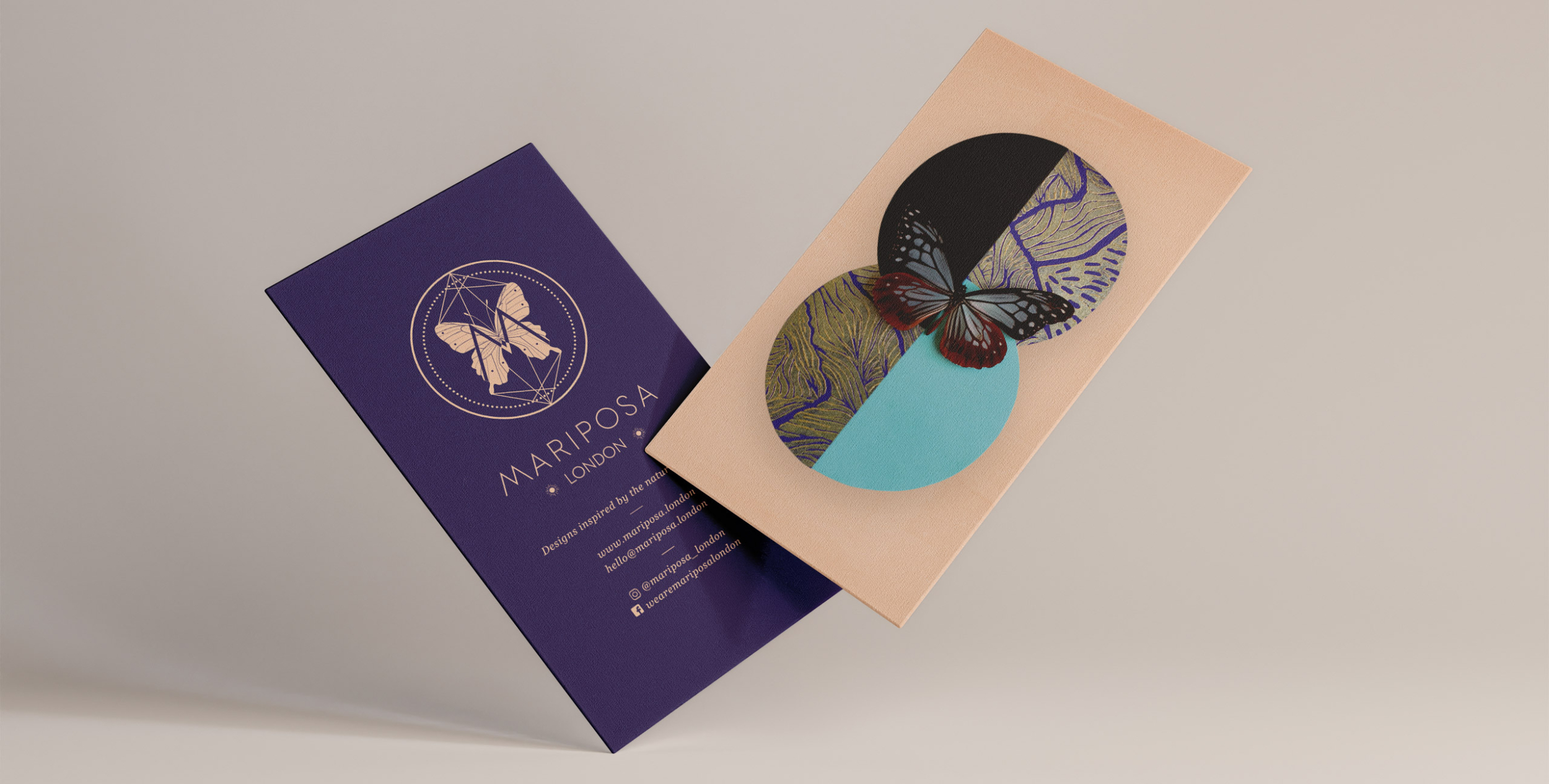
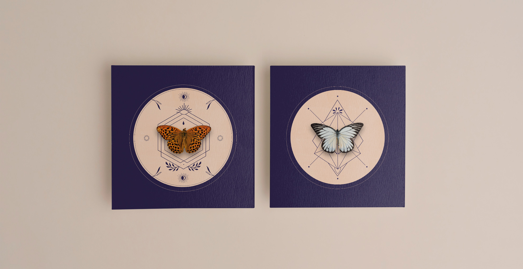
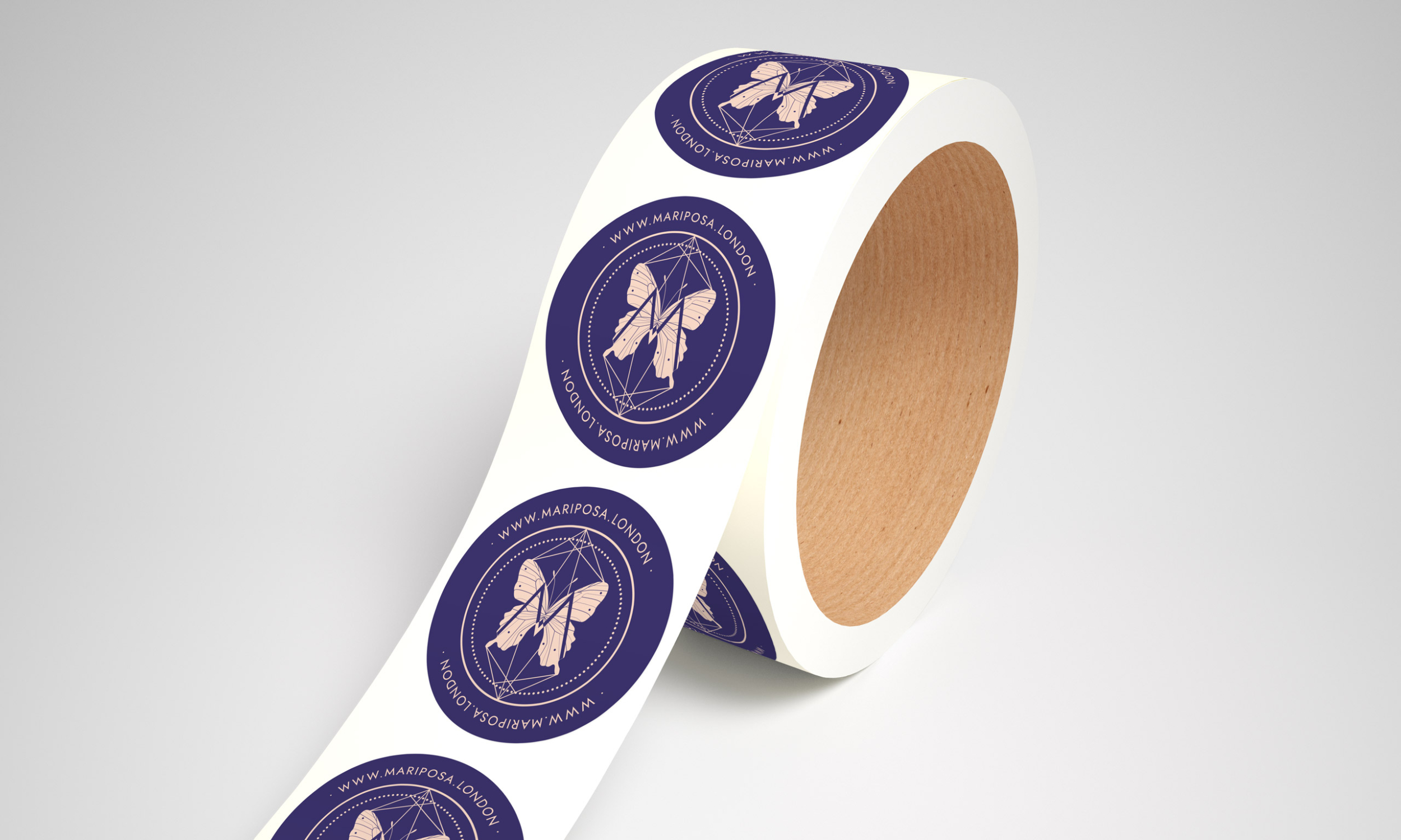
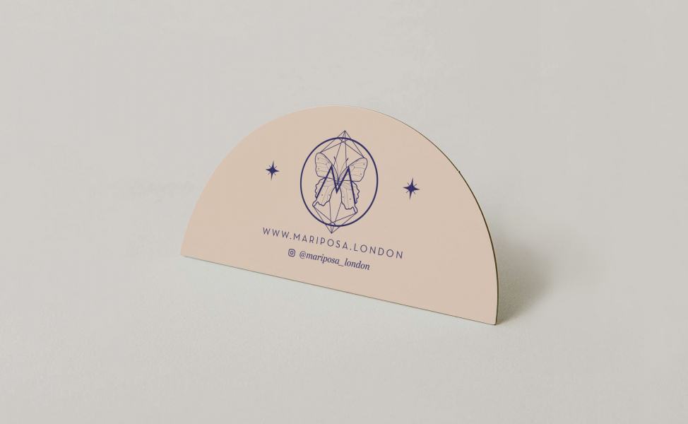
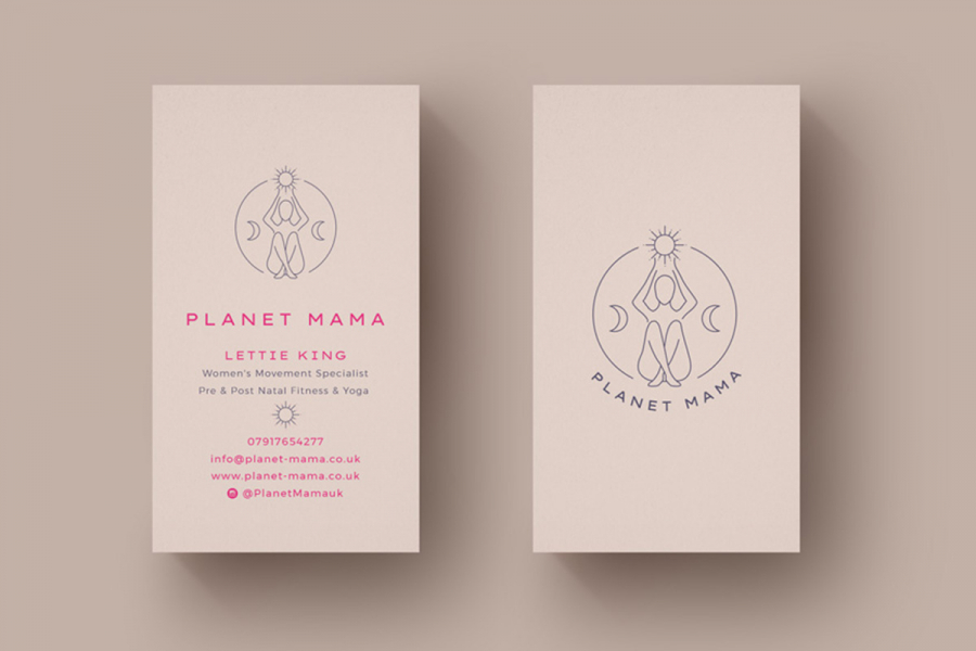
We worked closely with the artist and explored the many creative techniques used alongside her passion for sacred geometry and created a unique logo mark capturing the balance between the natural world and our own. The letter M mimics the symmetry in a butterflies wings perfectly so we wanted this to be one of the main features in telling the brands story.
Services
- Brand Identity
- Illustrations
- Print Design