Ninety One

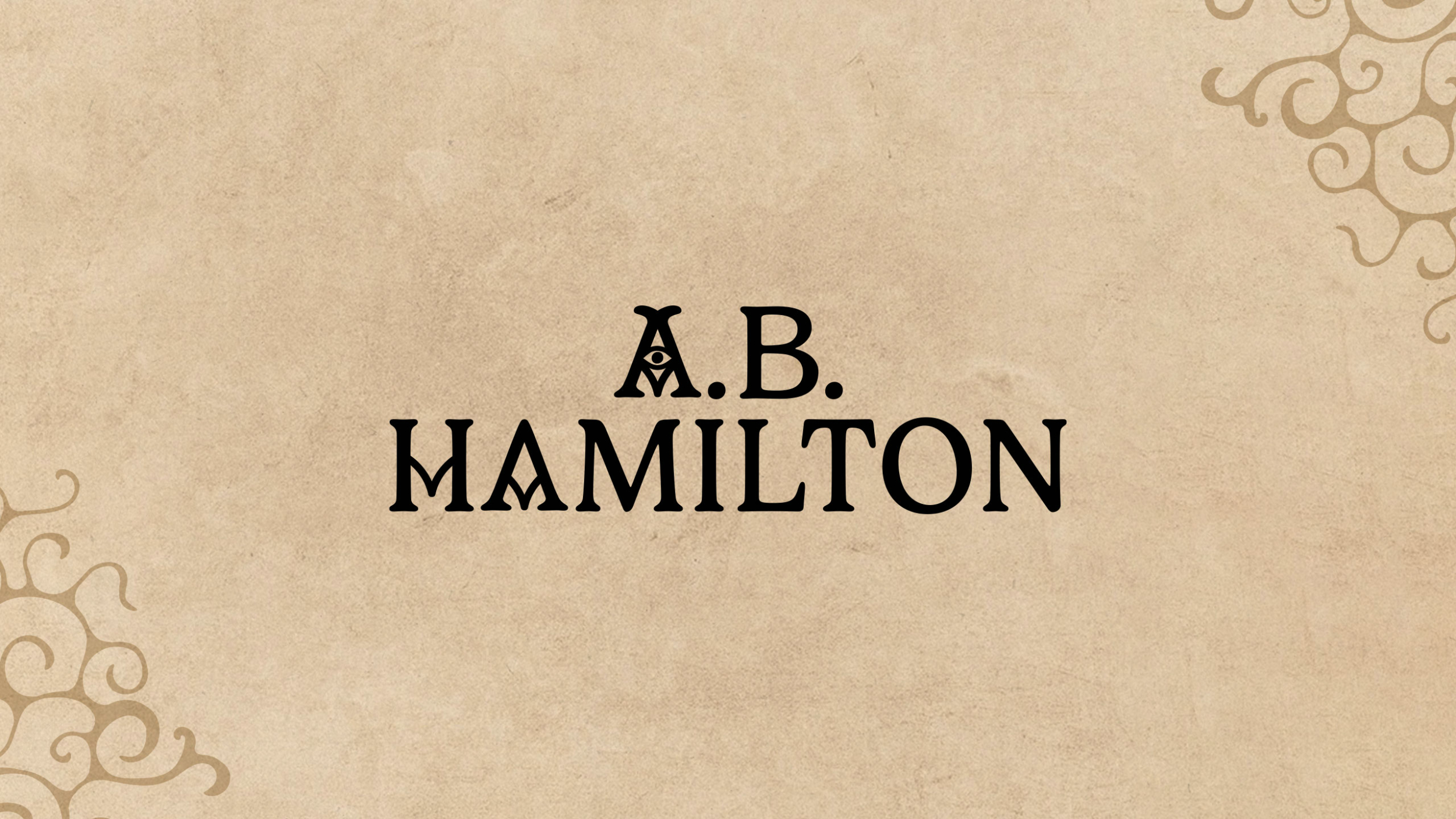
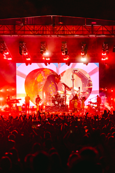
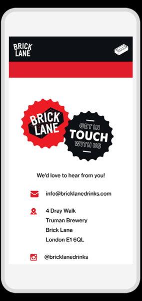
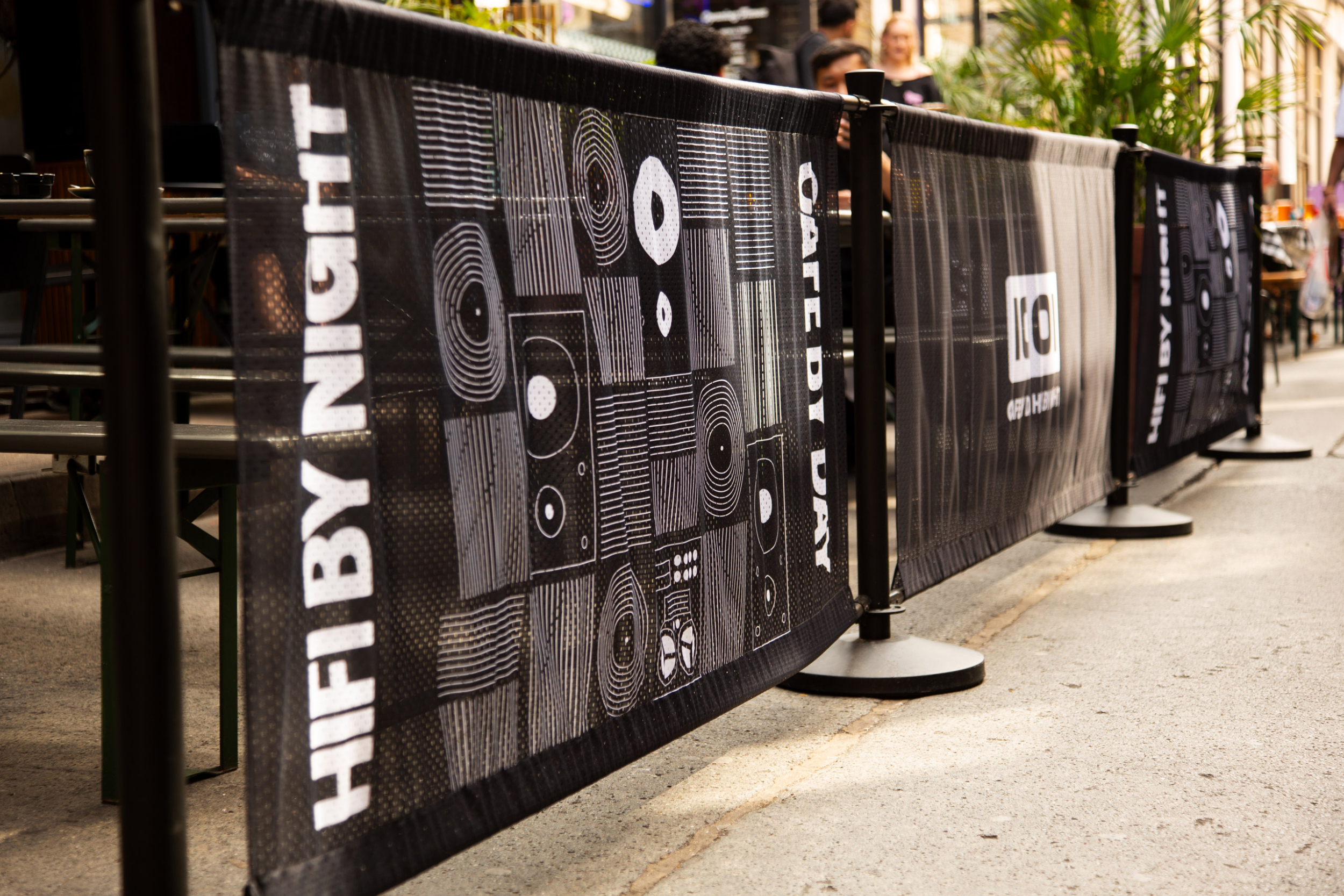
Ninety One is the newest addition to the iconic Truman Brewery estate on Brick Lane. This marks our 8th venue rebrand in a 7-year creative partnership with the development owners who were looking to open a new pub on the site of what was once the largest brewery in the world. Our challenge was to design a brand that would honour that immense heritage but feel current and welcoming enough to entice current and future generations of pub goers.

Services

  • Brand Identity
  • Interior Design
  • Merch Design
  • Signage
  • Web Design

Partners

The creative direction for Ninety One was rooted in the foundational concept of being “Your Local.” Rather than designing for a specific niche, our strategy was to build an inclusive brand identity that felt welcoming to the diverse demographic of modern Brick Lane – from the weekday office workers and the local creative community to the weekend explorers.

We balanced heritage-inspired elements with a contemporary hospitality edge, using a palette of forest green and burnt orange to provide a comforting, traditional backdrop. By focusing on the shared human experience of a “local pub,” we crafted an identity that transcends trends and focuses on the long-term social fabric of the area.

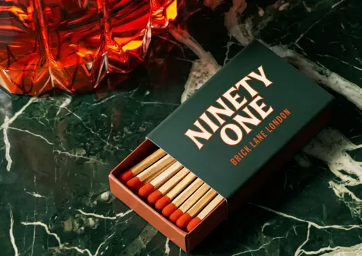
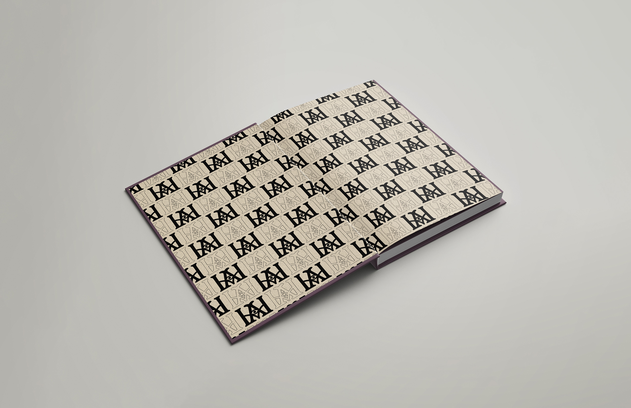
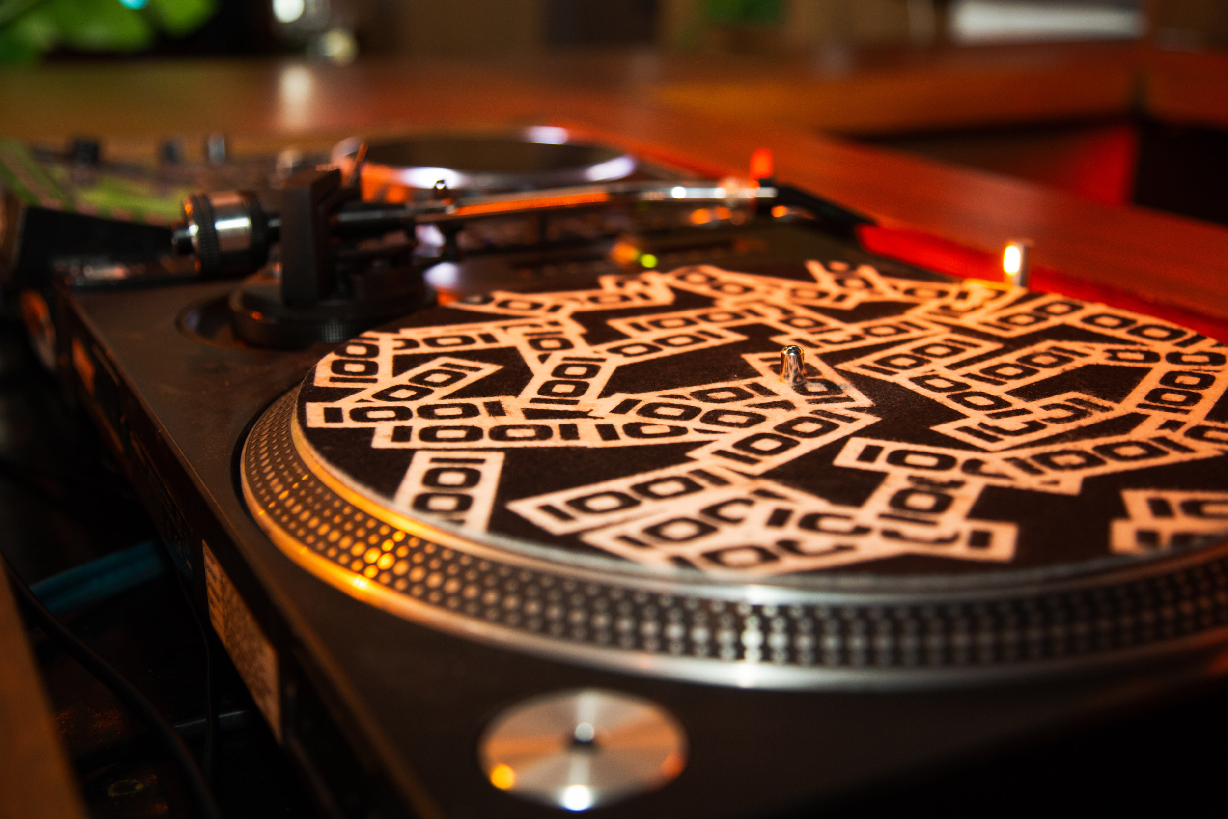
We believe that a hospitality brand truly lives in the hands of the customer, so we developed a comprehensive suite of physical and digital assets to ensure a seamless experience. The core visual identity and secondary monogram system were applied across a wide range of tactile touchpoints, including textured card-stock menus, beer tap badges, bespoke coasters, and custom-branded matchboxes.

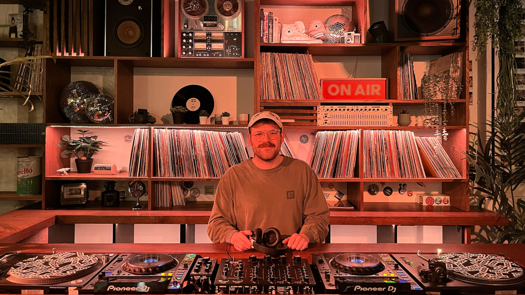
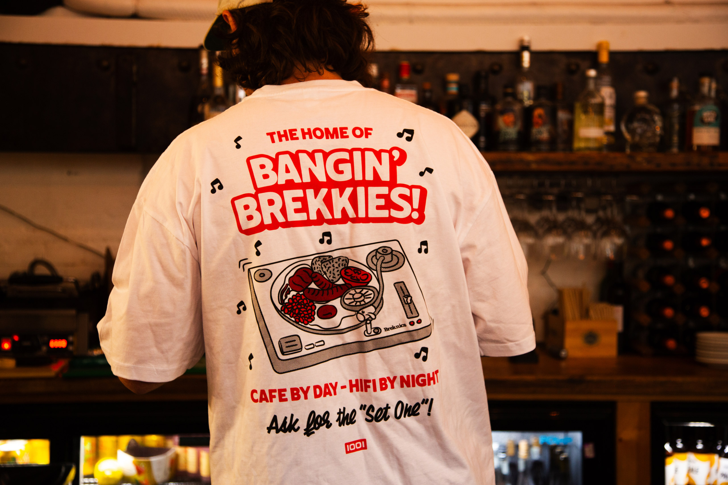
We also oversaw the environmental design, which included hand-painted interior signage and wayfinding that integrates naturally with the building’s architecture. To complete the rollout, we produced heavy-weight apparel for the staff team and created motion graphics to bring the brand to life across digital platforms.

Ninety One launched as a standout destination in Shoreditch, successfully bridging the gap between iconic historical status and modern hospitality. By leveraging the site’s unique heritage through a cohesive, physical-first branding strategy, we helped the Truman Brewery team transform a historic space into a vibrant and welcoming destination. This project stands as a testament to our long-term partnership with the estate and our commitment to creating brands that feel deeply rooted in their specific time and place.

A Curious Herbal

A curious herbal brand identity by another kindA curious Herbal, we are one box and bottle packaging design

A Curious Herbal is a botanical studio rooted in the ancient rhythms of the earth. We were commissioned to create the brand identity and luxury packaging design for their flagship elixir, WE ARE ONE—a high-vibrational perfume hand-crafted in small batches during the Equinox and Solstice.

The scent is more than a fragrance; it is a ritual. Because the elixir is handmade during specific celestial alignments, the packaging needed to feel like a physical extension of that energy. We wanted the brand to feel established yet mystical, bridging the gap between traditional herbalism and modern luxury.

Services

  • Brand Identity
  • Packaging Design
  • Print Design

Photography

We developed a holistic visual system that carried across the primary bottle labelling, secondary packaging, and bespoke collateral. To reflect the purity of the ingredients, we chose a beautifully heavy, textured white card stock. The tactile experience was paramount, featuring deep-strike debossing and gold foil detailing that catches the light—mimicking the celestial inspiration behind the scent.

We created a custom suite of botanical and celestial icons used across the product labelling and accompanying ritual cards. This ensured that every touchpoint—from the moment of unboxing to the daily use of the bottle—felt intentional and sacred.

a curious herbal cards by another kind
a curious herbal box design by another kind

Brand Identity

Another Kind Studio : Brand identity design agency for impactful brands

Your brand identity is the strategic blueprint for your business—it’s the foundation upon which every customer interaction is built. Another Kind Studio is a London brand identity design agency specialising in developing cohesive, high-impact visual identities that are both unique and effective.

We go beyond logo design to create a robust system that gives your brand a clear voice, strategic focus, and memorable presence across all touchpoints, ensuring you stand out in competitive markets like music, hospitality, and lifestyle.

Our ProcessWhat We Deliver

Discovery & Strategy

This is the essential starting point where we define the DNA of your brand. Our discovery and strategy phase involves deep collaboration to ensure the final design is built on solid business goals, not just aesthetics. We begin with thorough market research, stakeholder interviews, and a comprehensive brand audit to pinpoint your unique position in the market.

This phase results in clearly defined brand positioning, tone of voice, and core messaging, establishing a strategic blueprint that guides every visual decision we make and ensures your identity resonates authentically with your target audience.

Core Visual Identity

With the strategy locked in, we move into the creative heart of the project: designing the visual elements that make your brand instantly recognisable. The core visual identity phase focuses on developing your essential assets, starting with a powerful logo design and a robust lockup system that works across all mediums.

We meticulously define your primary and secondary color palettes, select cohesive typography, and develop any necessary brand illustrations or iconography. This ensures you have a distinctive and flexible visual language—a true visual identity system—that captures the soul of your brand as defined in the strategy phase.

Identity Application

A great brand identity must be functional. In the identity application phase, we demonstrate how your new visual system comes to life across real-world and digital touchpoints.

This involves applying the core identity to essential business collateral, from stationery and internal templates to crucial customer-facing assets like custom packaging design concepts, retail signage, and merchandise.

The Final Guide

To ensure your brand investment delivers long-term value, we conclude every project by producing a comprehensive set of brand guidelines. This final guide is your complete instruction manual for maintaining brand integrity across all future applications, whether handled by internal teams, external printers, or other agencies.

It meticulously documents the rules for logo usage, colour values, typography hierarchy, imagery style, and tone of voice. This deliverable is key to ensuring your visual identity remains consistent, cohesive, and impactful for years to come.

Why Choose Us?More Than Aesthetics: Identity as Strategy

As a dedicated brand identity agency, we treat every project as a strategic challenge. We understand that a great brand identity must be:

  1. Future-Proof

    Designed to grow and adapt over time without losing core recognition

  2. Growth-Focused

    Directly aligned with your business objectives, driving recognition and revenue.

  3. Cohesive

    Functional across diverse mediums, from digital platforms and web design to physical products and merchandise.

Say HelloGet In Touch

Ready to build a powerful foundation for your business? Want to work together?

Send us an email and let’s chat.

We do...

A.B. Hamilton

A.B. Hamilton logoA.B. Hamilton logo

We designed a comprehensive brand identity for author A.B. Hamilton to support the launch of his debut novel, Beastwoven, targeting the young adult fantasy audience. The goal was to establish a consistent, powerful presence that conveys literary depth, modern thought and a unique perspective rooted in mysticism and storytelling. The visual identity is built around a distinctive logo suite, rich colour palette and elegantly surreal graphic elements.

Services

  • Brand Identity
  • Illustrations
  • Web Design
  • Web Development
  • Website

The primary wordmark features a clean, modern serif font, enhanced by a stylised eye motif within the “A,” suggesting an otherworldly gaze or hidden power. This is complemented by a unique monogram that acts as a personal crest, ensuring instant brand recognition across various platforms. To add visual texture and thematic depth, we developed bespoke iconography inspired by ancient runes, which acts as a mystic and alchemical visual language. These elements, along with imaginative character illustrations create a cohesive aesthetic that subtly hints at the novel’s complex themes of order, chaos, and the warped nature of reality.

Visit the wonderfully weird website here at ABHamilton.com.

A.B. Hamilton iconography design
A.B. Hamilton endpapers
A B Hamilton Mobile website designs by Another Kind

Love Motion

Logo and brand identity design for Love Motion FestivalLogo and brand identity design for Love Motion Festival

We were tasked with creating the music festival brand identity and event design for Love Motion, a vibrant new festival that celebrates disco, soul, and electronic music as part of South Facing Festival at Crystal Palace Park in London. The event, headlined by the legendary Nile Rodgers & CHIC, brought together an incredible lineup of artists, including Louie Vega, Dimitri From Paris, Cerrone, and the House Gospel Choir. Our goal was to design a visual identity that captured the electric and high-energy atmosphere of the festival.

Services

  • Brand Identity
  • Event Design
  • Event Identity
  • Merch Design

Partners

Design of festival flags for Love Motion Festival

Concept & Design

Inspired by the pulsating energy of a dance floor, our branding concept took inspiration from heat maps. We used an abstract gradient palette of deep purples, fiery reds, and golden yellows to represent the warmth and motion of a crowd in full swing. To create a captivating focal point, we paired these hypnotic gradients with a 3D glass heart, symbolizing the love for music that unites festival-goers. For the typography, we chose the bold, retro typeface Herbus to give the brand an authentic disco-era feel. The combination of the modern, abstract gradients with this classic typeface resulted in a visual language that felt both contemporary and nostalgic.

Artist stage visual design for Louie Vega at Love Motion Festival
VIP festival wristband design for Love Motion Festival
Instagram social media template design for Love Motion Festival

Deliverables

Our work for Love Motion spanned across a wide range of applications, ensuring a cohesive experience for all attendees. The final deliverables included: Festival visuals, line up posters, flags, wayfinding signage, artist passes, wristbands, lanyards, social media content templates and a range of merchandise sold at the festival.

Prime Direct Distribution

We were really excited to partner with Prime Direct Distribution – a true legend in the vinyl world – on a fresh rebrand and extensive new B2B website. A key element of this evolution that we designed was a new circular “P” logo, taking inspiration from classic vinyl center labels. It’s a minimal nod to their analog vinyl heritage and a key part of their updated look. Our primary goal for this project was crafting a slick new website aimed at making music discovery and ordering the latest vinyl releases as effortless as possible for their global network of record shops and retailers. This new online hub isn’t just for placing orders though; it’s also designed to show potential new partners – stores, labels, artists – how Prime Direct Distribution can help them with all aspects of music promotion and distribution.

Services

  • Brand Identity
  • Merch Design
  • Packaging Design
  • Website

Following the launch of their new online presence, we also designed some physical touchpoints to complement the updated brand: impactful delivery box packaging, vinyl slipmats, caps and over-sized t-shirts. This project was all about creating a cohesive brand experience for Prime Direct Distribution that feels as good as the records they distribute – a smooth online journey backed up by some quality merch to drive their business growth.

Brick Lane Beer

We partnered with Brick Lane Drinks to deliver updated beer branding and packaging design for their flagship beer range. The goal was to create a strong, recognisable brand identity that stands out from competition.

Our design approach centered on a bold, high-impact aesthetic: utilizing a primary color palette, minimal typography, and introducing a new isometric brick logo. We applied this design system across cans and bottle labels, ensuring maximum shelf presence.

To deepen customer engagement, we also developed a bespoke one-page website. This digital experience immerses visitors in the brand’s history, showcases their diverse range of beer styles, and serves as a direct guide to their flagship Brick Lane Beer Taproom.

Their delicious range of lagers, pale ales, and IPAs can be found at all Truman Brewery venues off Brick Lane in Shoreditch, East London.

Services

  • Brand Identity
  • Packaging Design
  • Web Design
  • Website

Partners

Brick Lane Beer logo and brand identity design for bottle labels

Backyard Market

We partnered with Backyard Market to craft a comprehensive new brand identity that authentically reflects the dynamic spirit of this cherished East End makers market. Our core goal was to create a visual system that would enhance the market’s visibility, foster community connection, and seamlessly incorporate elements of East London’s cultural heritage and contemporary flair.

The design solution focused on expressive, tangible elements:
Typography: We selected an eclectic typeface to represent the diverse nature of the market’s vendors.
Visual Elements: This was paired with bold, hand-drawn shapes and brush strokes—a deliberate choice to emphasize the artisanal, handmade quality of the goods sold.
Colour: A vibrant, high-energy colour palette was chosen to ensure the brand stands out and immediately communicates creativity and vitality to a wide audience.

This unique identity celebrates the talents of East London’s creative community and strengthens the market’s local presence at its centre.

Services

  • Brand Identity
  • Print Design

Cafe 1001

Cafe 1001 logo design and bespoke vinyl record shelvingCafe 1001 logo design and bespoke vinyl record shelving

We’ve had the pleasure of partnering with Café 1001 for over 4 years, helping transform this legendary East London venue on Brick Lane into a beautiful and vital cultural hub. As a dynamic space that seamlessly blends a café, workplace, cocktail bar, and a vibrant disco, Café 1001 is a place to eat, drink, work, and unwind. Our goal was to create a flexible brand identity that allows the venue to thrive in its many endeavours.

The core of our branding was inspired by the venue’s bespoke vinyl shelving and listening bar aesthetic. We developed a repeating geometric line pattern as the key visual element, using a clean monochrome colour palette. This pattern was applied across a wide range of touch points, from food and drink packaging to the branded barriers outside, creating a cohesive and instantly recognisable identity.

Our design work for Café 1001 spanned numerous applications, including: Menus, posters, food and drink packaging, wayfinding and signage, merchandise and slipmats as well as an extensive Cafe 1001 website.

Services

  • Brand Identity
  • Illustrations
  • Merch Design
  • Signage
  • Web Design
  • Web Development
Bespoke vinyl shelving and custom DJ booth at Cafe 1001 with a rotary mixer
Cafe 1001 minimal vinyl pattern custom cafe barrier banner brand identity design East London Shoreditch Brick Lane
cafe 1001 custom logo cinyl DJ slipmat design
Cafe 1001 bespoke brand identity website design and development on a laptop screen

Radio 1001

During the pandemic, we worked with the team to launch Radio 1001, an online radio station created to keep the community connected through music. The station has since grown into a thriving YouTube channel, featuring daily streams from local and global DJ talent. This project has been a rewarding collaboration, and we’re proud to have played a part in designing the visual language for a space that continues to bring people together through music.

Radio 1001 logo brand identity design
Bangin' Brekkies T-Shirt design for Cafe 1001 in Shoreditch East London with bespoke vinyl turntable with full english breakfast illustration
Bespoke vinyl shelving and custom speakers at Cafe 1001 for customer seating area with stools

Crafty Apple Cider

We love working with local businesses near us so we jumped at the chance when cider distributor Real Al approached us about designing a new cider brand identity and packaging for their flagship in-house brand. The owners were keen to create a playful and engaging brand that would grab customers’ attention across web, packaging, POS and merch.

The initial stages of the branding project for Crafty Apple were carried out by brilliant artist Leo Franchi who created paper cut patterns and illustrations using scanned apple peel as a perfect starting point. We then collaborated on bringing these wonderful graphics into a range of cider bottles and cans, packaging, merch and POS materials with new chunky typography lock ups and attention grabbing layouts.

Services

  • Brand Identity
  • Merch Design
  • Packaging Design
  • Web Design
  • Web Development

Partners

Crafty Apple Cider Branding Bottle Labels
Crafty Apple Brochure Branding and Graphic Design
Brand identity and logo design for Crafty Apple cider bottle labels
Crafty Apple Beer Mats and Pump Clip badges
Crafty Apple Cider Owners at Real Al Co

Arnabeet

Brand identity and logo design for Arnabeet Modern Syrian Kitchen

We collaborated with the founders of Arnabeet to establish a powerful brand identity for their Syrian street food concept, aimed at making a memorable entry into the London market.

Our goal was to translate some of the vibrancy of Syrian culture into a cohesive visual language. The brand is built on a foundation of custom design elements:
A dedicated cauliflower symbol to serve as the immediate, memorable brand marker.
An accompanying bold, geometric pattern carefully abstracted from traditional Arabic tile designs, lending a modern yet culturally rich aesthetic.

We applied this new identity across all essential deliverables for their launch, including the design and production of menus, custom aprons, and eye-catching signage for their new location at the celebrated Seven Dials Market.

Services

  • Brand Identity
  • Packaging Design
  • Print Design
  • Signage
Brand identity and logo design for Arnabeet Modern Syrian Kitchen

YRDS

YRDS is a sports marketing agency set to disrupt the space by promoting authenticity and transparency for their clients.

We collaborated with the co-founders to craft a brand identity that reflects their refreshingly unique approach. To avoid the industry’s blandness, we created a visually assertive system: a bold, condensed typeface with sharp edges, energised by fluorescent colour palette accents. This dynamic foundation also includes bespoke gradients and patterns that feature a distinctive ‘Y’ icon, derived from the deconstructed typeface, to ensure maximum brand recall.

The entire visual language was then translated into the agency’s digital presence with a comprehensive new website design and social media templates and motion graphics establishing YRDS as a confident force in the industry.

Services

  • Brand Identity
  • Web Design
  • Web Development
Brand identity and logo design for YRDS sports marketing agency
Logo and brand identity design on business cards for YRDS sports marketing agency
arrow