A.B. Hamilton

A.B. Hamilton logoA.B. Hamilton logo

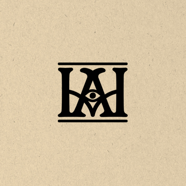
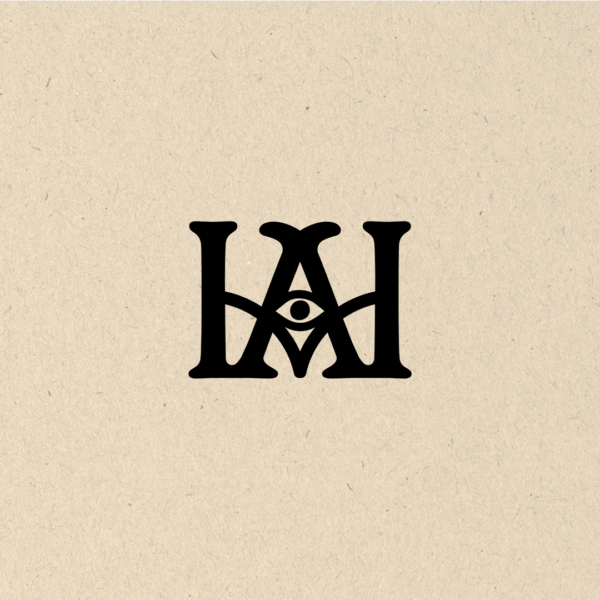
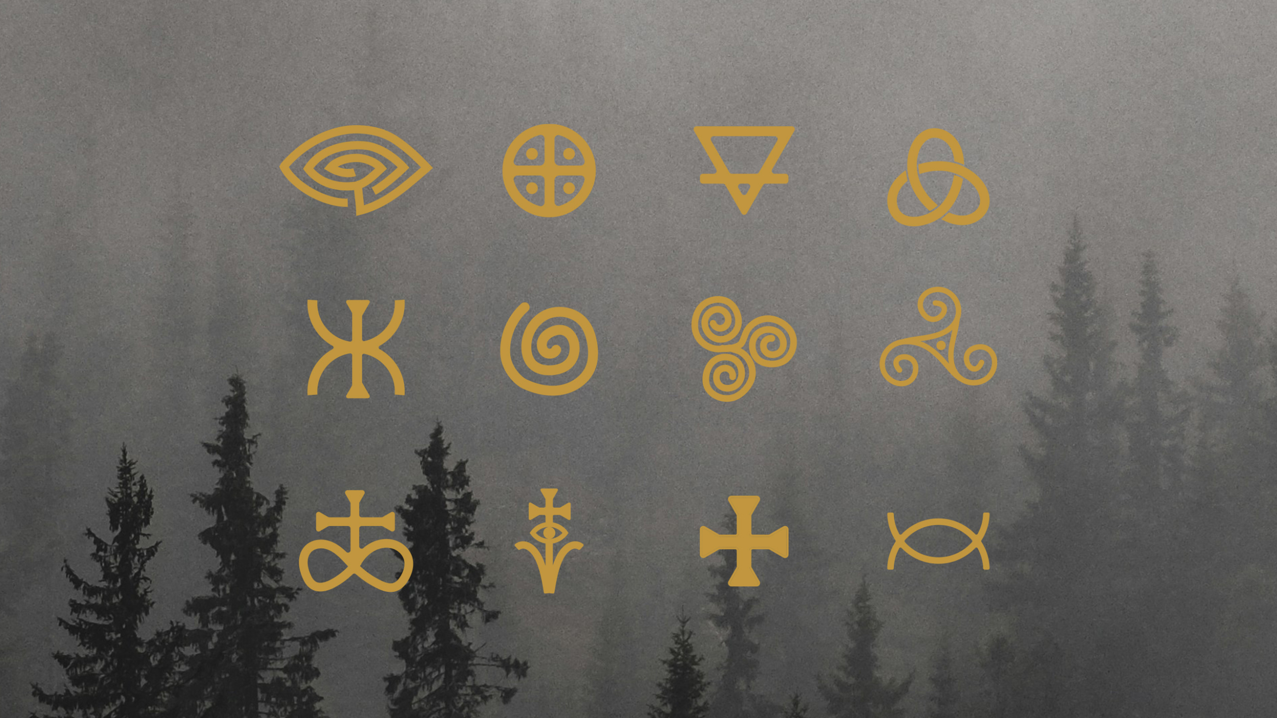
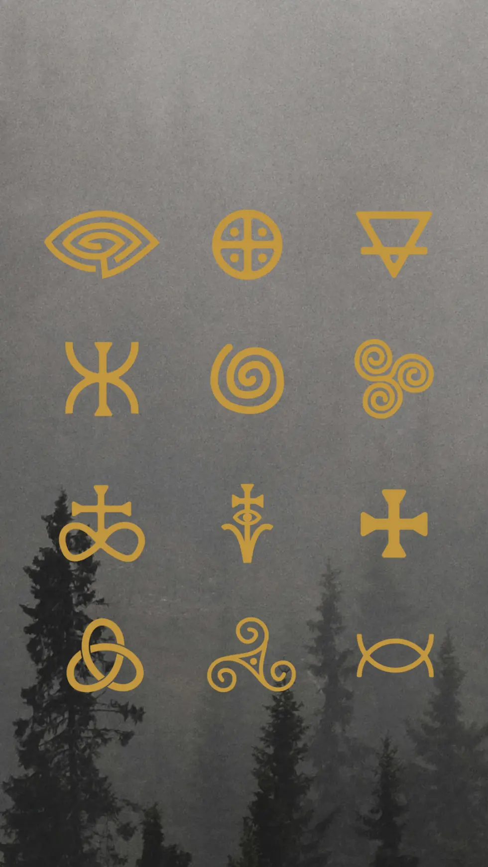
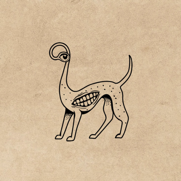
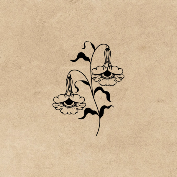
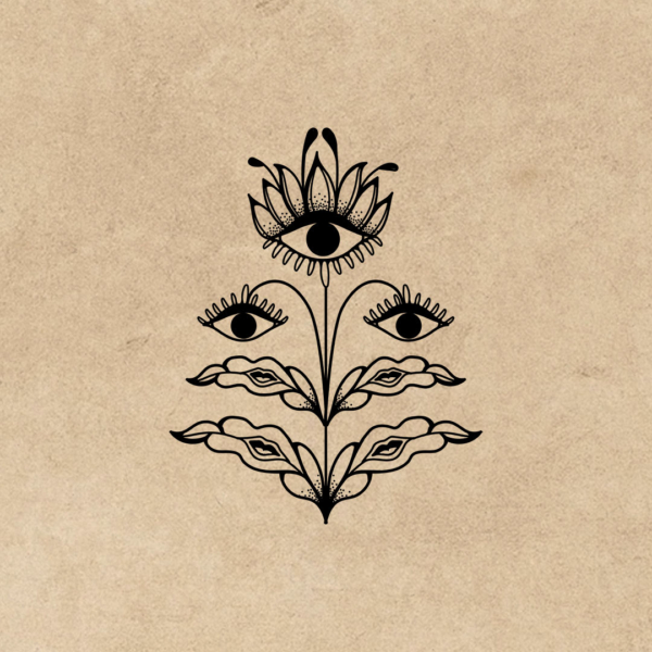
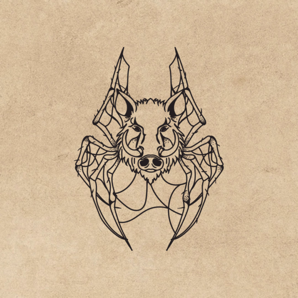
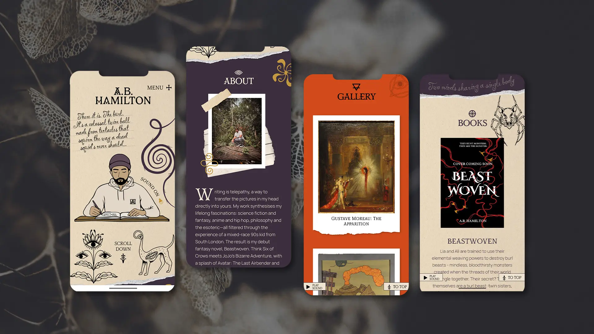
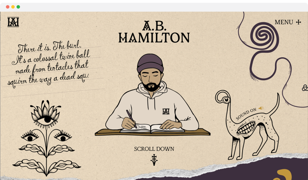
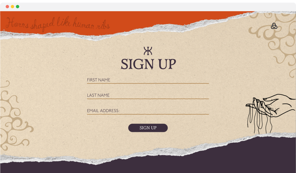
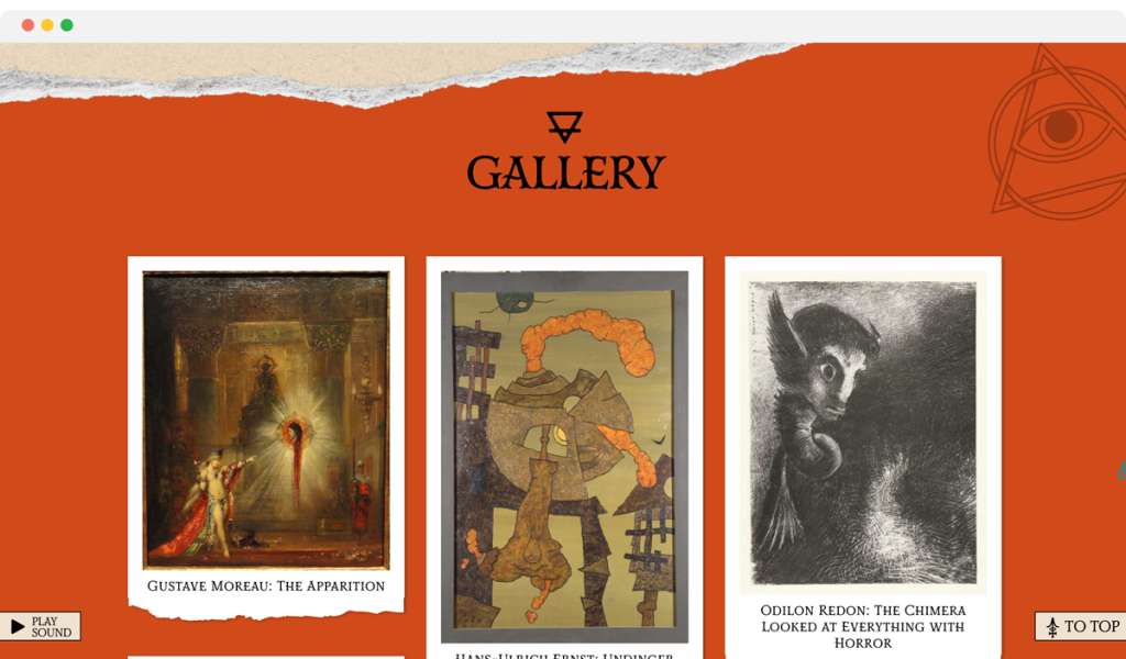
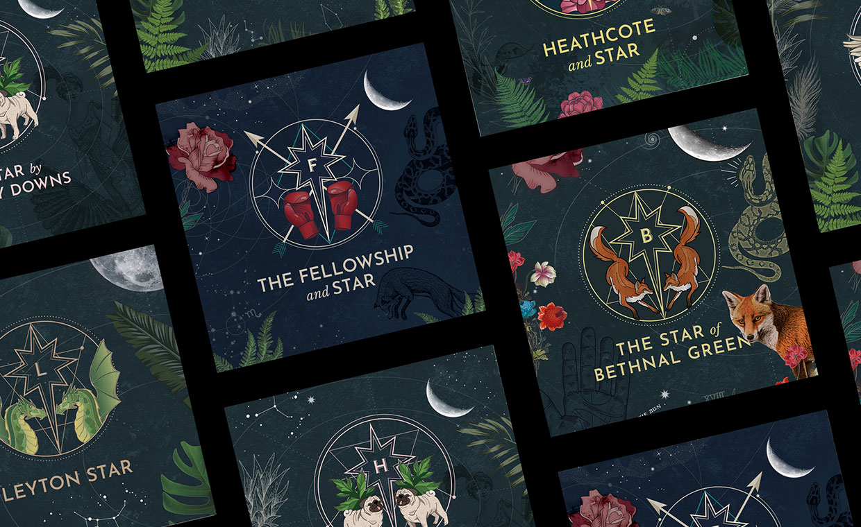
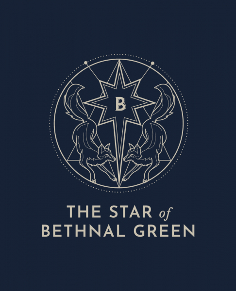
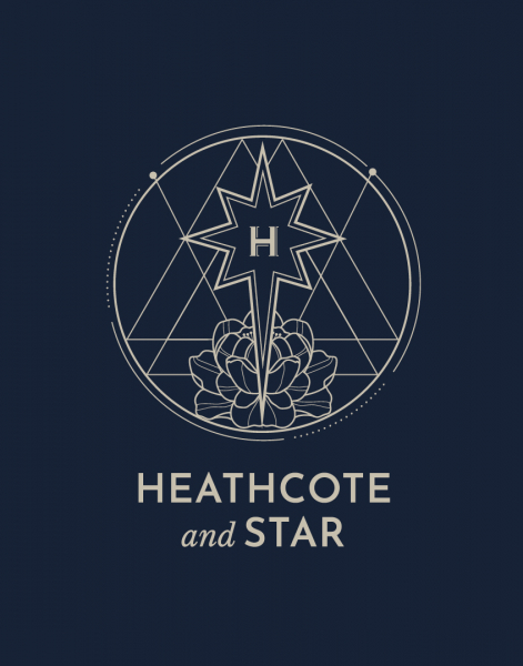
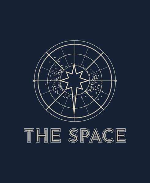
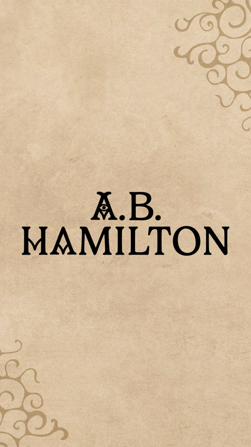
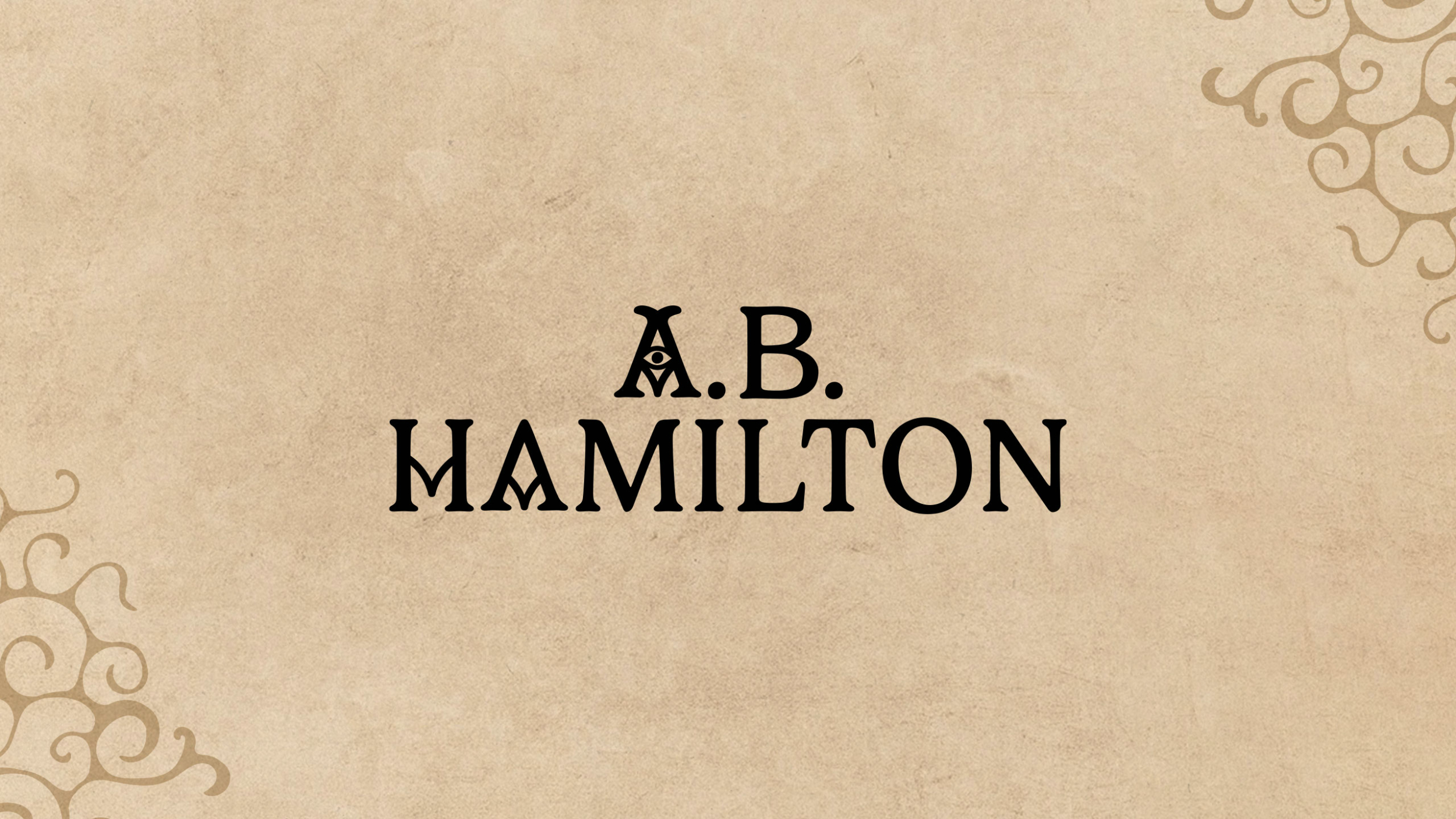
We designed a comprehensive brand identity for author A.B. Hamilton to support the launch of his debut novel, Beastwoven, targeting the young adult fantasy audience. The goal was to establish a consistent, powerful presence that conveys literary depth, modern thought and a unique perspective rooted in mysticism and storytelling. The visual identity is built around a distinctive logo suite, rich colour palette and elegantly surreal graphic elements.

Services

  • Brand Identity
  • Illustrations
  • Web Design
  • Web Development
  • Website

The primary wordmark features a clean, modern serif font, enhanced by a stylised eye motif within the “A,” suggesting an otherworldly gaze or hidden power. This is complemented by a unique monogram that acts as a personal crest, ensuring instant brand recognition across various platforms. To add visual texture and thematic depth, we developed bespoke iconography inspired by ancient runes, which acts as a mystic and alchemical visual language. These elements, along with imaginative character illustrations create a cohesive aesthetic that subtly hints at the novel’s complex themes of order, chaos, and the warped nature of reality.

Visit the wonderfully weird website here at ABHamilton.com.

A.B. Hamilton iconography design
A.B. Hamilton endpapers
A B Hamilton Mobile website designs by Another Kind

Prime Direct Distribution

We were really excited to partner with Prime Direct Distribution – a true legend in the vinyl world – on a fresh rebrand and extensive new B2B website. A key element of this evolution that we designed was a new circular “P” logo, taking inspiration from classic vinyl center labels. It’s a minimal nod to their analog vinyl heritage and a key part of their updated look. Our primary goal for this project was crafting a slick new website aimed at making music discovery and ordering the latest vinyl releases as effortless as possible for their global network of record shops and retailers. This new online hub isn’t just for placing orders though; it’s also designed to show potential new partners – stores, labels, artists – how Prime Direct Distribution can help them with all aspects of music promotion and distribution.

Services

  • Brand Identity
  • Merch Design
  • Packaging Design
  • Website

Following the launch of their new online presence, we also designed some physical touchpoints to complement the updated brand: impactful delivery box packaging, vinyl slipmats, caps and over-sized t-shirts. This project was all about creating a cohesive brand experience for Prime Direct Distribution that feels as good as the records they distribute – a smooth online journey backed up by some quality merch to drive their business growth.

Brick Lane Beer

We partnered with Brick Lane Drinks to deliver updated beer branding and packaging design for their flagship beer range. The goal was to create a strong, recognisable brand identity that stands out from competition.

Our design approach centered on a bold, high-impact aesthetic: utilizing a primary color palette, minimal typography, and introducing a new isometric brick logo. We applied this design system across cans and bottle labels, ensuring maximum shelf presence.

To deepen customer engagement, we also developed a bespoke one-page website. This digital experience immerses visitors in the brand’s history, showcases their diverse range of beer styles, and serves as a direct guide to their flagship Brick Lane Beer Taproom.

Their delicious range of lagers, pale ales, and IPAs can be found at all Truman Brewery venues off Brick Lane in Shoreditch, East London.

Services

  • Brand Identity
  • Packaging Design
  • Web Design
  • Website

Partners

Brick Lane Beer logo and brand identity design for bottle labels

235 Music Publishing

Logo and brand identity design for business cards for 235 Music Group

235 Music Publishing reached out to Another Kind to help with creating a clean and minimal brand identity for their forward thinking company. Final deliverables would include new logos, business cards, company stationary and a bespoke new website.

The brand identity had to be minimal enough to let artist imagery be the main focus of a new website yet bold enough to catch people’s eyes when seen on its own. We created a simple overlapping circular logo design that took inspiration from sound waves whilst also representing the company’s numbers in the abstract ascending rings. We paired the rings with an all caps typeface logo that would also inform the general no frills aesthetic of the brand’s wider typography.

Services

  • Brand Identity
  • Website

Electric Star Pubs

Logo and brand identity design for Star Pubs

We’ve partnered with the Electric Star Pubs to develop bespoke branding for their beautiful and ever-expanding portfolio of venues across East and South London. The challenge was to create distinct identities for each unique pub while maintaining instant recognition as an “Electric Star” property.

Our solution was a comprehensive, astrology-inspired logo and branding system. The core concept draws inspiration from constellations and geometry, treating each pub as a unique star in the group’s galactic portfolio. Each venue received its own individual aesthetic, complete with a unique illustrative motif and logo that perfectly reflects its personality and interior mood. This ensures that whether you’re stepping into a cozy corner pub or a vibrant party spot, the underlying brand connection remains clear.

Services

  • Brand Identity
  • Illustrations
  • Signage
  • Wayfinding
  • Website

The latest gem in the portfolio is The Lord Napier Star in Hackney Wick, which opened in 2021. Its identity captures the venue’s eclectic mix of vibrant graffiti and stunning interior design, helping it turn heads across London.

We expanded each unique identity across a wide range of touchpoints, including website designs, menu systems, posters, loyalty cards, and digital marketing assets. Furthermore, we collaborated closely with KAI Interiors to develop bespoke wayfinding and window graphics, seamlessly integrating the brand’s celestial theme into the physical space.

Planet Mama

We partnered with Planet Mama, founded by London-based women’s health movement specialist Lettie King, to develop a complete brand identity.

Planet Mama’s mission is to create a nurturing space where women feel supported and empowered throughout pregnancy, birth, and beyond. We translated this goal into a positive and empowering visual identity rooted in balance and accessibility.

Services

  • Brand Identity
  • Illustrations
  • Print Design
  • Website

The design features an illustrative logo lockup built on symmetry to convey the balanced ideology of yoga practice. The versatile composition allows logo elements to be easily extracted and adapted across various media. A refined, gentle colour palette and simple line illustrations ensure the brand is nurturing, modern, and highly accessible, while bold, confident typography provides a necessary grounding element. To enhance clarity across the brand’s diverse offerings, we also developed a suite of supporting icons for the website, covering pre- and post-natal support.

Beige and purple pattern design and brand identity for Planet Mama
arrow