Numero Group

Numero Group Website Vinyl Albums and LogoNumero Group Website Vinyl Albums and Logo

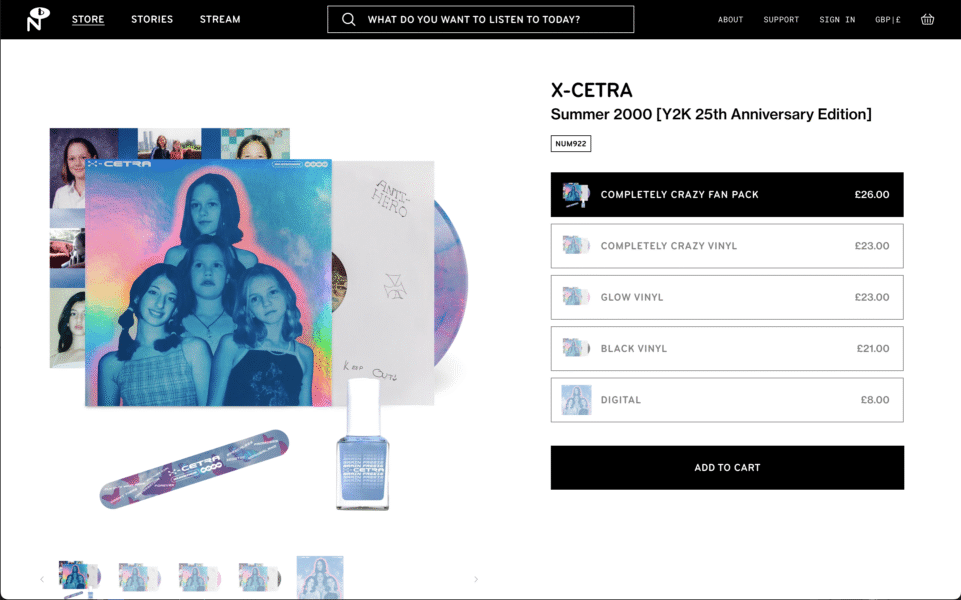
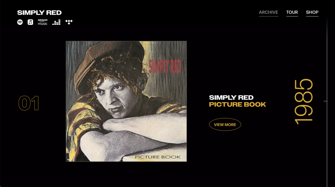
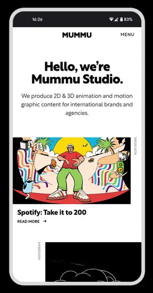
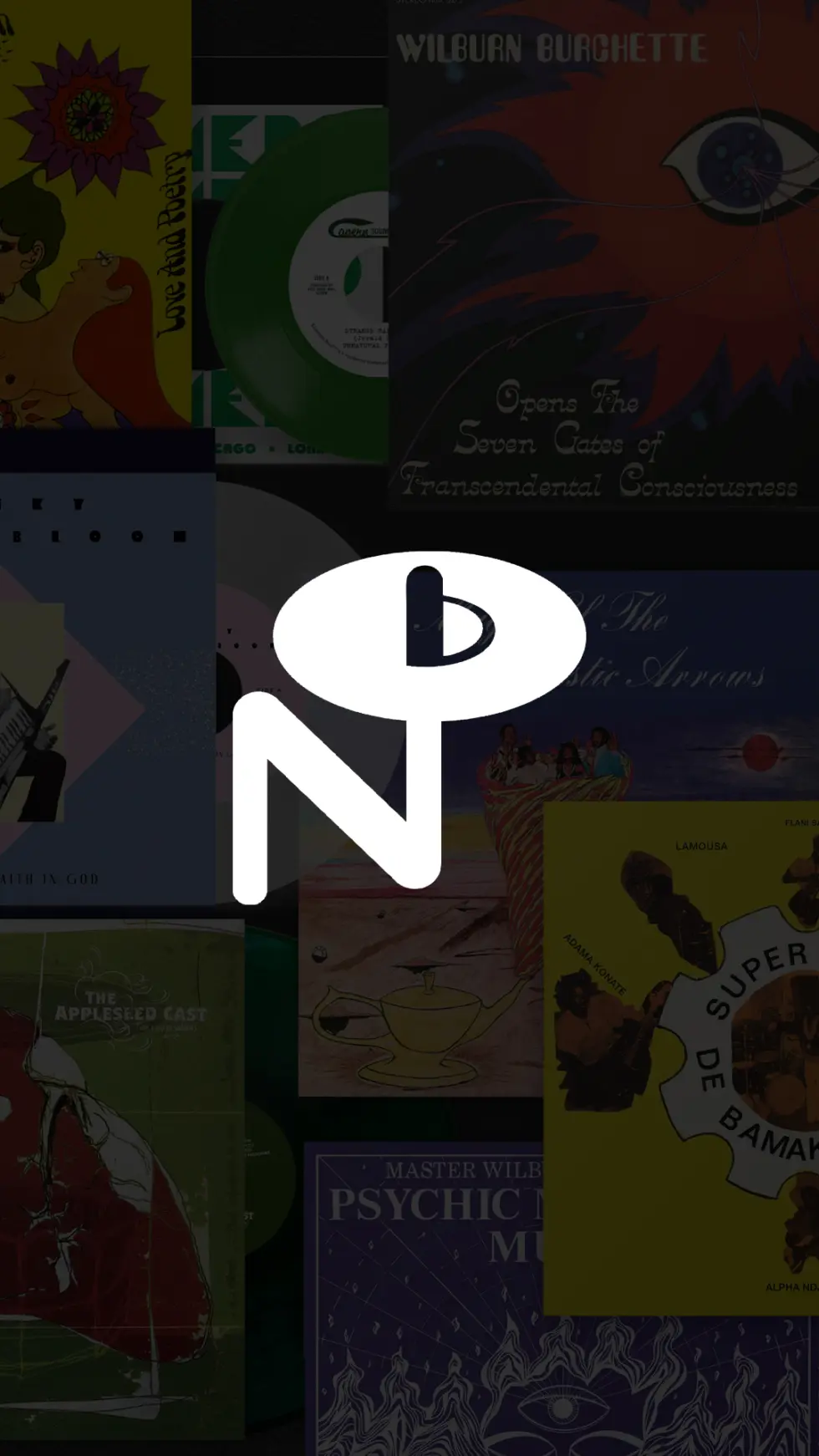
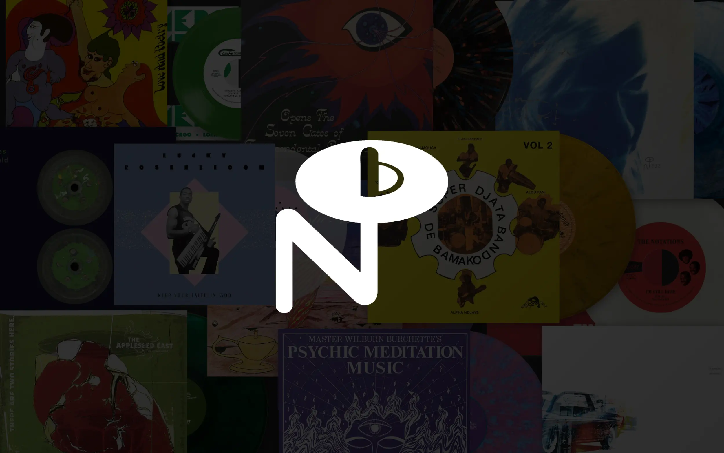
We created a new website for arguably the most niche music specialists in the game… 60s Country themed Xmas… check. Obscure Library music compilations… check. Y2K sleepover core from the US suburbs… check! The Numero Group are a pretty unique label who unearth long lost hidden music treasures and breath new life into these projects with highly collectable vinyl/digital albums.

When the team got in touch about a new website we jumped at the chance to work with such a well respected label. For our collaboration, the challenge was clear: design a website that honours their painstaking, aesthetically rich approach to archiving niche music history while providing a high-performance e-commerce experience that puts their immaculately curated products front and center.

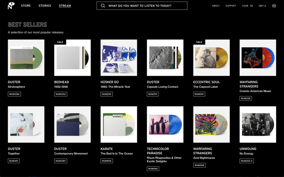
See if you can unearth your own new favourite music oddities on the new Numero Group website now.

Services

  • Web Design
  • Web Development

Partners

The new platform we delivered is built to service both the casual collector and the deep-catalog connoisseur. The resulting website redesign is driven by several key features: a custom archival search and filtering system allowing users to dive deep into the vast catalog; an engaging streaming playlist archive with cover flow, an integrated Stories section that tightly weaves their historical long form content alongside featured product listings; and a flexible e-commerce experience focused on highlighting their huge variety of vinyl, boxsets, 45s and merch.

Numero Group Individual mobile page website design examples

A.B. Hamilton

A.B. Hamilton logoA.B. Hamilton logo

We designed a comprehensive brand identity for author A.B. Hamilton to support the launch of his debut novel, Beastwoven, targeting the young adult fantasy audience. The goal was to establish a consistent, powerful presence that conveys literary depth, modern thought and a unique perspective rooted in mysticism and storytelling. The visual identity is built around a distinctive logo suite, rich colour palette and elegantly surreal graphic elements.

Services

  • Brand Identity
  • Illustrations
  • Web Design
  • Web Development
  • Website

The primary wordmark features a clean, modern serif font, enhanced by a stylised eye motif within the “A,” suggesting an otherworldly gaze or hidden power. This is complemented by a unique monogram that acts as a personal crest, ensuring instant brand recognition across various platforms. To add visual texture and thematic depth, we developed bespoke iconography inspired by ancient runes, which acts as a mystic and alchemical visual language. These elements, along with imaginative character illustrations create a cohesive aesthetic that subtly hints at the novel’s complex themes of order, chaos, and the warped nature of reality.

Visit the wonderfully weird website here at ABHamilton.com.

A.B. Hamilton iconography design
A.B. Hamilton endpapers
A.B. Hamilton mobile website

Simply Red

Another Kind worked with Simply Red, Quietus Management and Motive Unknown to design and build a bespoke new website to celebrate the band’s incredible 40th anniversary. This ambitious music fan archive web design project would be based around twelve of their studio albums with an album page being unlocked each month to provide a treasure trove of content for Simply Red fans to discover.

This included remastered videos, album documentary content, image galleries, limited edition merch, tour dates, press quotes and much much more. We also worked on upgrading the e-commerce experience as well as a special microsite for the launch of their new album: Recollections.

Head over to simplyred.com to discover the immersive website now.

Services

  • Web Design
  • Web Development

Cafe 1001

Cafe 1001 logo design and bespoke vinyl record shelvingCafe 1001 logo design and bespoke vinyl record shelving

We’ve had the pleasure of partnering with Café 1001 for over 4 years, helping transform this legendary East London venue on Brick Lane into a beautiful and vital cultural hub. As a dynamic space that seamlessly blends a café, workplace, cocktail bar, and a vibrant disco, Café 1001 is a place to eat, drink, work, and unwind. Our goal was to create a flexible brand identity that allows the venue to thrive in its many endeavours.

The core of our branding was inspired by the venue’s bespoke vinyl shelving and listening bar aesthetic. We developed a repeating geometric line pattern as the key visual element, using a clean monochrome colour palette. This pattern was applied across a wide range of touch points, from food and drink packaging to the branded barriers outside, creating a cohesive and instantly recognisable identity.

Our design work for Café 1001 spanned numerous applications, including: Menus, posters, food and drink packaging, wayfinding and signage, merchandise and slipmats as well as an extensive Cafe 1001 website.

Services

  • Brand Identity
  • Illustrations
  • Merch Design
  • Signage
  • Web Design
  • Web Development
Bespoke vinyl shelving and custom DJ booth at Cafe 1001 with a rotary mixer
Cafe 1001 minimal vinyl pattern custom cafe barrier banner brand identity design East London Shoreditch Brick Lane
cafe 1001 custom logo cinyl DJ slipmat design
Cafe 1001 bespoke brand identity website design and development on a laptop screen

Radio 1001

During the pandemic, we worked with the team to launch Radio 1001, an online radio station created to keep the community connected through music. The station has since grown into a thriving YouTube channel, featuring daily streams from local and global DJ talent. This project has been a rewarding collaboration, and we’re proud to have played a part in designing the visual language for a space that continues to bring people together through music.

Radio 1001 logo brand identity design
Bangin' Brekkies T-Shirt design for Cafe 1001 in Shoreditch East London with bespoke vinyl turntable with full english breakfast illustration
Bespoke vinyl shelving and custom speakers at Cafe 1001 for customer seating area with stools

Crafty Apple Cider

We love working with local businesses near us so we jumped at the chance when cider distributor Real Al approached us about designing a new cider brand identity and packaging for their flagship in-house brand. The owners were keen to create a playful and engaging brand that would grab customers’ attention across web, packaging, POS and merch.

The initial stages of the branding project for Crafty Apple were carried out by brilliant artist Leo Franchi who created paper cut patterns and illustrations using scanned apple peel as a perfect starting point. We then collaborated on bringing these wonderful graphics into a range of cider bottles and cans, packaging, merch and POS materials with new chunky typography lock ups and attention grabbing layouts.

Services

  • Brand Identity
  • Merch Design
  • Packaging Design
  • Web Design
  • Web Development

Partners

Crafty Apple Cider Branding Bottle Labels
Crafty Apple Brochure Branding and Graphic Design
Brand identity and logo design for Crafty Apple cider bottle labels
Crafty Apple Beer Mats and Pump Clip badges
Crafty Apple Cider Owners at Real Al Co

YRDS

YRDS is a sports marketing agency set to disrupt the space by promoting authenticity and transparency for their clients.

We collaborated with the co-founders to craft a brand identity that reflects their refreshingly unique approach. To avoid the industry’s blandness, we created a visually assertive system: a bold, condensed typeface with sharp edges, energised by fluorescent colour palette accents. This dynamic foundation also includes bespoke gradients and patterns that feature a distinctive ‘Y’ icon, derived from the deconstructed typeface, to ensure maximum brand recall.

The entire visual language was then translated into the agency’s digital presence with a comprehensive new website design and social media templates and motion graphics establishing YRDS as a confident force in the industry.

Services

  • Brand Identity
  • Web Design
  • Web Development
Brand identity and logo design for YRDS sports marketing agency
Logo and brand identity design on business cards for YRDS sports marketing agency

Mummu Studio

We were asked by the animation team at Mummu to help update their studio with a new brand identity and portfolio website. Another Kind were briefed with developing a refreshed visual identity that would allow them to divide their company into two new identities: Mummu Studio and Mummu Health.

The project required the development of two complimentary company identities as well as a new brand animation style for use on two separate websites and Mummu social platforms. We developed a minimal line art brand identity that informed the design choices of a pair of new websites. The minimal frameworks would allow all the diverse animations and illustrations in their client work to shine and take centre stage.

Services

  • Brand Identity
  • Web Design
  • Web Development

Carpark Records

Carpark Records logo and brand identity designCarpark Records logo and brand identity design

Our graphic design studio partnered with the USA-based record label Carpark Records to deliver a complete refresh of their online presence. The goal was to provide a high-impact record label brand identity and web design to elevate their website and e-commerce platform.

The previous site required updated designs and new functionality to significantly improve the online shopping experience. We started by creating a bold new look and feel for the brand, incorporating US highway signage-influenced typography and illustrative logo updates for a confident, attention-grabbing first impression.

Specialising in e-commerce web design for music, we then completely re-designed and re-built their entire online store, leveraging the robust Shopify platform for stability and superior sales functionality.

Have a look at the site in full at carparkrecords.com.

Services

  • Brand Identity
  • Web Design
  • Web Development
Carpark Records brand identity and mobile music website e-commerce store design

Terry’s Cafe

Terry's Cafe English Breakfast Crockery design photoTerry's Cafe English Breakfast Crockery design photo

We partnered with Terry’s Cafe, the legendary traditional English cafe and full English breakfast institution located on Great Suffolk Street, South London. Founded in the early 1980s by former Smithfield market trader Terry, the business is now proudly run by his son, Austin. He commissioned us to re-invigorate the South London cafe brand identity and web design, balancing a modern appeal with deep respect for the cafe’s long-standing history and its status as a local landmark.

Services

  • Brand Identity
  • Illustrations
  • Print Design
  • Web Design
  • Web Development

Photography

Terry's Cafe owner Austin

Core Identity

Our approach to the cafe branding and design focused on celebrating the business’s heritage while elevating its visual presence. The new brand identity features a distinctive golden beveled logo system paired with a premium, nostalgic colour palette of red, gold, white and cream. We used bold vintage raised typography to give the design a tactile feel, ensuring the identity feels timeless and authentic to its physical South London location.

Brand identity and logo design for Terry's Cafe in South London
Sub mark logo and brand identity design for Terry's Cafe Pilsner
Logo and brand identity design for Terry's Cafe burgers
Terry's Cafe Signage Exterior Photo

Application & Merchandise

We deployed this cohesive design system across all essential cafe collateral, including sub-brand logos, new shop signage, window decals, custom crockery and tableware, business cards, and menu designs. A unique element of the project was the creation of a full range of Terry’s Cafe merchandise, featuring bespoke mascot illustrations of Austin himself, adding personality and collectible appeal to the brand.

Digital Presence

We designed and developed a comprehensive cafe website (a key digital presence piece) that serves as the central hub for the brand. This site allows customers to explore the cafe’s history, check out the latest breakfast menus and specials, make table bookings, find news updates, and conveniently buy Terry’s Cafe merchandise online. This brand revitalisation project successfully positioned Terry’s Cafe for future growth while cementing its status as an authentic London breakfast spot and heritage cafe.

Terry's Cafe Interior
Terry's Cafe Bar & Grill Interior photo

Fire Records

The Fire Records team got in touch about designing a new e-commerce website that would raise awareness of their diverse artist roster and show off their beautifully designed record releases. We striped everything back and created a minimal framework and typography pairing in order to apply more focus on all of their amazing vinyl products and high res artist photography.

Services

  • Web Design
  • Web Development

The core to the new site is an extensive e-commerce platform that brings to the fore their incredible 30 year history as well as showcasing their newest releases. The discovery of their impressive catalogue is extended with engaging artist profiles and news stories bolstered by image galleries and video players.

www.firerecords.com

Noel Gallagher

We were approached by Noel Gallagher’s Sour Mash Records to design a special commemorative website that would showcase a new album called Back The Way We Came: Vol 1 (2011-2021). The project is a “Best Of” retrospective celebrating the first decade of Noel Gallagher’s High Flying Birds. The limited edition deluxe formats include a 12” 32 page coffee table photo book with deluxe 3CD set as well as a double LP. Another Kind were tasked with building a website that would allow fans to explore these highly bespoke products and delve deeper into the bands decade long history thanks to an immersive fan archive.

Services

  • Digital Design
  • Web Design
  • Web Development

To commemorate the 10 year mark we also designed a timeline section where users can enjoy highlights spanning the bands career from the beginning year by  year in a parallax format.

Have a browse through the new site for yourself : nghfb10.noelgallagher.com

Domino Records

Domino Records Neon Sign Logo

We were thrilled to partner with the iconic independent label, Domino Records, to reimagine and rebuild their online presence. Our goal was to create a digital experience that could house their rich history, showcase their diverse roster of artists, and significantly upgrade the functionality of their renowned Domino Mart store.

This project was a deep dive into balancing design aesthetics with sophisticated technical architecture, resulting in a site that is as functional as it is beautiful—a true reflection of Domino Records’ spirit.

Explore the Domino Records website now.

Services

  • Web Design
  • Web Development

Partners

The resulting website redesign is a flexible, performance-focused platform designed to serve the music fan, the media, and the label staff seamlessly. Key features we developed include:

Modular Artist Profiles: We engineered extensive, modular artist profile pages that allow the Domino team maximum flexibility. Each profile now integrates captivating photo galleries, detailed artist biographies, embedded video content, and dynamic album discovery modules complete with full tracklists. This rich, customisable layout ensures every artist’s unique identity is fully expressed.

Advanced Release Archive: We completely overhauled the label’s extensive release archive. Fans can now explore the full catalogue dating back to 1990 using a powerful and intuitive set of filtering and sorting tools. This reimagining transforms the process of discovering Domino’s vast musical history into an engaging experience.

Enhanced Domino Mart E-commerce: Recognizing the store’s importance, we gave the Domino Mart a major upgrade. The new site features engaging product and category layouts designed to improve product discovery, streamline the shopping experience, and better highlight their exclusive and limited-edition items.

arrow