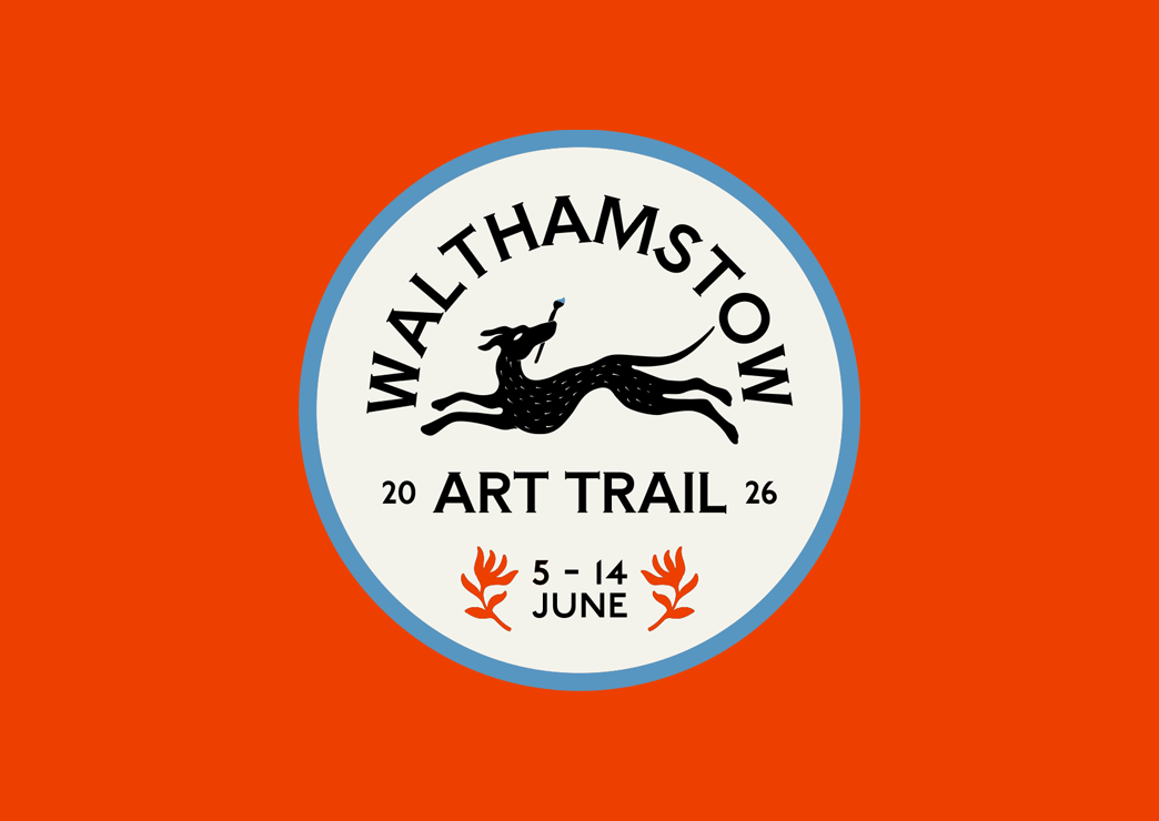
A Curious Herbal

A curious herbal brand identity by another kindA curious Herbal, we are one box and bottle packaging design

A Curious Herbal is a botanical studio rooted in the ancient rhythms of the earth. We were commissioned to create the brand identity and luxury packaging design for their flagship elixir, WE ARE ONE—a high-vibrational perfume hand-crafted in small batches during the Equinox and Solstice.

The scent is more than a fragrance; it is a ritual. Because the elixir is handmade during specific celestial alignments, the packaging needed to feel like a physical extension of that energy. We wanted the brand to feel established yet mystical, bridging the gap between traditional herbalism and modern luxury.

Services

  • Brand Identity
  • Packaging Design
  • Print Design

Photography

We developed a holistic visual system that carried across the primary bottle labelling, secondary packaging, and bespoke collateral. To reflect the purity of the ingredients, we chose a beautifully heavy, textured white card stock. The tactile experience was paramount, featuring deep-strike debossing and gold foil detailing that catches the light—mimicking the celestial inspiration behind the scent.

We created a custom suite of botanical and celestial icons used across the product labelling and accompanying ritual cards. This ensured that every touchpoint—from the moment of unboxing to the daily use of the bottle—felt intentional and sacred.

a curious herbal cards by another kind
a curious herbal box design by another kind

Specialist Packaging and Print Design Agency

In the physical world, your product’s packaging is its most critical marketing tool. Another Kind Studio is a packaging and print design agency dedicated to creating high-impact physical assets that demand attention, communicate quality, and drive purchasing decisions.

From product labels and custom boxes to exhibition collateral and intricate album artwork, we specialise in merging strategic brand identity with flawless production management. We ensure your final printed piece is as effective and memorable as the digital experiences we create.

How can we help?Our Core Print and Packaging Capabilities

Product Packaging Design

We design packaging that not only protects your product but defines your brand on the shelf.

  • Beverage Packaging: Custom bottle labels, can wraps and multi-pack design.
  • Retail & Food: Takeaway containers, custom food packaging, and consumer goods labels.
  • Merchandise & Promotional Items: Branded retail packaging, custom boxes, and bespoke promotional items (e.g., slipmats, stickers).

Specialist Music and Album Artwork

With deep roots in the music industry, we excel at designing high-end physical music formats that collectors love.

  • Vinyl Packaging Design: Full gatefold jackets, inner sleeves, and center label design for LPs and EPs.
  • CD and Cassette Design: Layout and preparation for physical discs and wallets.
  • Print Design: Creation of lyric booklets, liner notes, and limited-edition posters.

Print and Environmental Assets

We handle all necessary brand applications required to bring your physical space or campaign to life.

  • Environmental & Signage Design: Large-scale graphics, restaurant/café signage, window decals, and wayfinding systems.
  • Marketing Collateral: Brochures, editorial design, menus, business stationery, and direct mail assets.
  • Event & Exhibition Graphics: Stand design, banners, and print assets for festivals and cultural events.

Say HelloGet In Touch

Ready to build a powerful foundation for your business? Want to work together?

Send us an email and let’s chat.

We do...

Backyard Market

We partnered with Backyard Market to craft a comprehensive new brand identity that authentically reflects the dynamic spirit of this cherished East End makers market. Our core goal was to create a visual system that would enhance the market’s visibility, foster community connection, and seamlessly incorporate elements of East London’s cultural heritage and contemporary flair.

The design solution focused on expressive, tangible elements:
Typography: We selected an eclectic typeface to represent the diverse nature of the market’s vendors.
Visual Elements: This was paired with bold, hand-drawn shapes and brush strokes—a deliberate choice to emphasize the artisanal, handmade quality of the goods sold.
Colour: A vibrant, high-energy colour palette was chosen to ensure the brand stands out and immediately communicates creativity and vitality to a wide audience.

This unique identity celebrates the talents of East London’s creative community and strengthens the market’s local presence at its centre.

Services

  • Brand Identity
  • Print Design

AC Soul Symphony – Metamorphosis

Vinyl album cover artwork design for AC Soul Sypmhony

We worked with Z Records founder Dave Lee to create an surrealist album cover illustration for AC Soul Symphony’s Metamorphosis. This album is uniquely centered around a 20-piece live orchestra, which we visualizsed in the album design by illustrating the string instruments in abstracted forms. This approach created a final composition reminiscent of oil paintings from the early surrealist movement. We then came up with two harmonious colour variations for the two-part double vinyl LP, CD, and digital cover art.

Services

  • Album Design
  • Illustrations
  • Print Design

Arnabeet

Brand identity and logo design for Arnabeet Modern Syrian Kitchen

We collaborated with the founders of Arnabeet to establish a powerful brand identity for their Syrian street food concept, aimed at making a memorable entry into the London market.

Our goal was to translate some of the vibrancy of Syrian culture into a cohesive visual language. The brand is built on a foundation of custom design elements:
A dedicated cauliflower symbol to serve as the immediate, memorable brand marker.
An accompanying bold, geometric pattern carefully abstracted from traditional Arabic tile designs, lending a modern yet culturally rich aesthetic.

We applied this new identity across all essential deliverables for their launch, including the design and production of menus, custom aprons, and eye-catching signage for their new location at the celebrated Seven Dials Market.

Services

  • Brand Identity
  • Packaging Design
  • Print Design
  • Signage
Brand identity and logo design for Arnabeet Modern Syrian Kitchen

Mariposa London

An embroidery artist from London obsessed with nature and wildlife, Mariposa London started their journey with butterfly taxidermy until they realised that it was impossible to guarantee the butterflies sourced had died naturally. So she decided to make her own from scratch using thread and wire.
We worked closely with the artist and explored the many creative techniques used alongside her passion for sacred geometry and created a unique logo mark capturing the balance between the natural world and our own. The letter M mimics the symmetry in a butterflies wings perfectly so we wanted this to be one of the main features in telling the brands story.

Services

  • Brand Identity
  • Illustrations
  • Print Design

Terry’s Cafe

Terry's Cafe English Breakfast Crockery design photoTerry's Cafe English Breakfast Crockery design photo

We partnered with Terry’s Cafe, the legendary traditional English cafe and full English breakfast institution located on Great Suffolk Street, South London. Founded in the early 1980s by former Smithfield market trader Terry, the business is now proudly run by his son, Austin. He commissioned us to re-invigorate the South London cafe brand identity and web design, balancing a modern appeal with deep respect for the cafe’s long-standing history and its status as a local landmark.

Services

  • Brand Identity
  • Illustrations
  • Print Design
  • Web Design
  • Web Development

Photography

Terry's Cafe owner Austin

Core Identity

Our approach to the cafe branding and design focused on celebrating the business’s heritage while elevating its visual presence. The new brand identity features a distinctive golden beveled logo system paired with a premium, nostalgic colour palette of red, gold, white and cream. We used bold vintage raised typography to give the design a tactile feel, ensuring the identity feels timeless and authentic to its physical South London location.

Brand identity and logo design for Terry's Cafe in South London
Sub mark logo and brand identity design for Terry's Cafe Pilsner
Logo and brand identity design for Terry's Cafe burgers
Terry's Cafe Signage Exterior Photo

Application & Merchandise

We deployed this cohesive design system across all essential cafe collateral, including sub-brand logos, new shop signage, window decals, custom crockery and tableware, business cards, and menu designs. A unique element of the project was the creation of a full range of Terry’s Cafe merchandise, featuring bespoke mascot illustrations of Austin himself, adding personality and collectible appeal to the brand.

Digital Presence

We designed and developed a comprehensive cafe website (a key digital presence piece) that serves as the central hub for the brand. This site allows customers to explore the cafe’s history, check out the latest breakfast menus and specials, make table bookings, find news updates, and conveniently buy Terry’s Cafe merchandise online. This brand revitalisation project successfully positioned Terry’s Cafe for future growth while cementing its status as an authentic London breakfast spot and heritage cafe.

Terry's Cafe Interior
Terry's Cafe Bar & Grill Interior photo

Planet Mama

We partnered with Planet Mama, founded by London-based women’s health movement specialist Lettie King, to develop a complete brand identity.

Planet Mama’s mission is to create a nurturing space where women feel supported and empowered throughout pregnancy, birth, and beyond. We translated this goal into a positive and empowering visual identity rooted in balance and accessibility.

Services

  • Brand Identity
  • Illustrations
  • Print Design
  • Website

The design features an illustrative logo lockup built on symmetry to convey the balanced ideology of yoga practice. The versatile composition allows logo elements to be easily extracted and adapted across various media. A refined, gentle colour palette and simple line illustrations ensure the brand is nurturing, modern, and highly accessible, while bold, confident typography provides a necessary grounding element. To enhance clarity across the brand’s diverse offerings, we also developed a suite of supporting icons for the website, covering pre- and post-natal support.

Beige and purple pattern design and brand identity for Planet Mama
arrow